I had a communication recently which in part asked for advice on the best way to render hair in a caricature. I was going to reproduce my short reply here but as is usually the case it has expanded into something more comprehensive. No doubt I will think of further things down the line, but if you've been having problems yourself or just want to know how I go about it then read on, and I hope you can get something from it.
In this post I've referred mainly to drawings, as cross-hatching and shading feature heavily with this format, but some of the advice offered will hold true for painted caricatures, digital or actual.
All caricatures shown below are created digitally using a cintiq in SketchBook Pro.
The ApproachAnyone looking at past drawings of mine will notice that I don't always render hair the same way, and certainly not always with high detail. I usually approach each caricature from a fresh start point and try and think about the effect I want to achieve. Sometimes I want to render the hair with high detail while other times I want to keep it simple - even blocked in with total black or white. Certain approaches can help to accentuate the comic effect over the serious - and to achieve this I try to consider not just the
shape of the drawn hair but the
style that is used within it.
The Shape Vs The StyleThe two main criteria to consider when approaching the hair is exactly the same as for the face - or any other part of the caricature - which is first, how to caricature/stretch/morph the hair (thus giving it
The shape) and second, how to best represent the quality of the massed strands of hair (giving it
The Style). A style can be anything from shading, cross-hatching, straight or squiggled lines to wavy patterned strokes as well as blocked areas of black or white.
John Kerry
Although the shape of the hair is important as it's a major element in the success of the overall caricature, this post is more leaning towards how hair itself is rendered, so from here on I'll concentrate on that.
Style - simpleSometimes very exuberantly detailed cross-hatching or shading in the hair will actually detract from the overall effect of the caricature. It's not always necessary to draw every last strand as this can overwork a caricature, especially if the face is already highly detailed with crosshatching. I understand that it's tempting to always and everywhere render at full capacity by filling in every corner of a caricature in order to show off a learned drawing technique. The danger is thinking 'more is more' when in fact it's 'less...'. It's all about what you focus on in the image - and you
should have a focal point as contrast will help the image have more 'punch'.
In the above caricature of John Kerry, not only did I keep the lines simple but I suggested a type of pattern or wave. I felt this gave a more comical effect to the image as well as contrasting the cross-hatching in his face.
Sometimes by keeping the hair devoid of busy detail, volume can be suggested with simple lines by paying attention to the thickness of the pencil stroke - which would include considering how it tapers (see image below of Robin Williams).
Robin Williams Gabriel Faure The caricature of Gabriel Faure above shows fairly simple hair as it's mainly comprised of blank space. Just some lines to denote basic architecture help place the hair in space. The white contrasts well with the hatched face.
Style - busyWhen not simplifying hair to make it contrast better with heavily crosshatched faces I will go all out on it by considering it an intricate 3d object - so I'm looking to have locks and strands pass under and over each other to help give the illustration volume in space. I'd suggest keeping cross-hatching on hair to an absolute minimum as too much can 'confuse' that area and pull it away from actually looking like hair. Instead, consider drawing strands in the direction they naturally lie and if you want to suggest darker areas then either block it in or draw massed smaller strands running in the same direction. Other than that, the same rules apply to the hair as they do everywhere else.
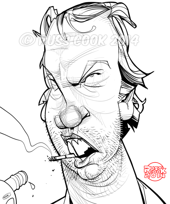
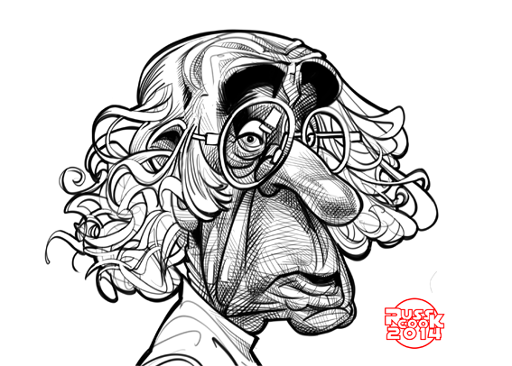
Ben Stiller & David Tennant
The above two images show how layered, wavy, thick or tangled hair can be scuplted and filled with detail. By not applying cross-hatching to the hair but representing strands drawn 'in direction', the detail in the hair doesn't fight with the cross-hatching in the face.
As an aside from the hair issue: further contrast is achieved with David Tennant's caricature by foresaking detail in his jacket and using almost abstract block areas to denote the dark pin-striped suit - it just gives it that extra punch I was referring to. (click on image for closer look).
Directional light Sometimes you may wish to consider a half-way approach between simplicity and detail by combining areas of shading/heavy line work in the hair as well as blocking out whole sections - either in black, to show deep shadow - or white, to suggest a strong light source. Consider the images below to see how this can be achieved:
Peter Capaldi
By using a combination of detail in the hair near the forehead and temples and leaving the top section white, a strong light source is suggested. Combined with the light reflecting off the actual temples, this has helped make the drawing more pleasing (though not automatically more successful)
Hair StylesNot all hair is the same! We may know it but we don't neccessarily draw it. Hair can be straight, curly, slicked back or shaved to the length of stubble, and therefore must have different drawing techniques applied to them to best represent each look. Below are some examples of different styles and comments on how I went about each one:
Shaved and shiny!
Roberto Di Matteo This is a kind of inversion of what I've suggested above, though the principle holds true. I've used simple cross-hatching in the hair in distinction to the lack of detail in the face, therefore, a contrast remains for the desired effect. The shine was created by just using a soft eraser brush on SketchBook Pro.
White & Wild
Ibrahim Tapa The white 'Mucha' curls sit nicely against the cross-hatched face
Black & Conditioned
Michael Madsen
I just blocked in the entire hair then took a white brush to draw in the highlights. Again, with the help of the solid black jacket, the central details of the hatched face pop-out.
Greased, Oiled and SmarmedShia Labeouf
Similar to Michael Madsen above, a lot of blacked-in blocks are used but locks are seperated out and more highlights are added. Notice how the light hits the sharp edges of where the hair folds back. If locks lie flat and level in relation to themselves then keep all highlights level and in a line. Raise and lower the position of highlights to accentuate difference if the sections of hair sit at different levels. Again here, the basic idea of lines, and not hatching, make up the pomaded architecture of Shia's locks.Hatching kills shine!
Natural Afro-Textured
Miles Davis
Not as much blocking in with solid black as you might first imagine. I wanted the highlights to be from unsketched areas and not filled in with white after the fact. The highlights above his widow's peak give the hair volume in space as well as showing a difference in hair height, front to back.
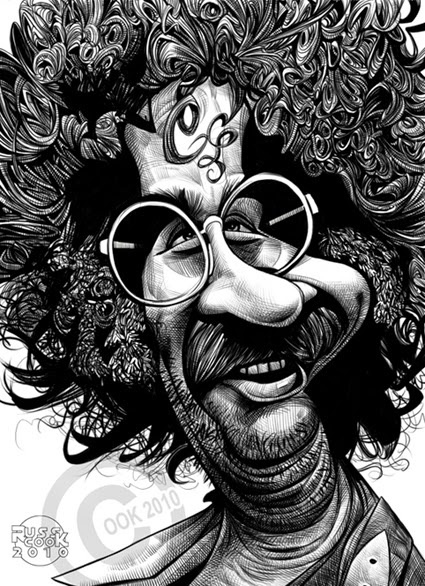
Wild Abandon
Jerry Garcia
OK, this is well over the top and all attempts at realism have been abandoned in favour of humour by producing a ludicrous level of (hatched!) detail to Jerry's wild mop. However, there's enough blocked black in the image to stop this failing altogether and as I don't think 'conditioning' was high in Jerry's concerns at the time, the wool-like texture of the hair's cross-hatching can stand.
Be prepared to break any of the above rules if by doing so you first; make the likeness of the subject more recognisable and second; make the caricature funnier. These must remain the primary concern. It doesn't matter how you've approached describing the hair or whether you've made it look photographically real or not, it must meet the condition that any other element of the caricature must achieve: if it doesn't possess the qualities of helping make the caricature instantly recognisable, and to a lesser degree humourous, then it's been done wrong.